# From Sketch to Grid (Why Grid?)
Where Grid has gotten interesting for me is in how I can match mock-ups with almost 1-to-1 efficiency. I do this by declaring my grid exactly as the designer declared theirs in Sketch (or other apps that have grid layout systems). It’s very common to get a mock-up with a 12 column grid, so I start with code that looks like this (for a 3 column layout):
.grid {
  grid-gap: 2rem;
  display: grid;
  grid-template-columns: repeat(12, 1fr);
  grid-template-areas: “a a a a b b b b c c c c”;
}
That might seem like overkill until you get a request from a designer that a child item should start 1 column left/right or span 5 columns instead of 4. Matching the mocked grid is future-proofing my work. With that grid in place, I can still use grid-area: 1/1/1/span 7; or some other variation. I might have to manage the prefixing myself, but that’s a small price to pay for maximum flexibility.
.child {
  /* Manage prefixing ourselves */
  /* If you use `grid-gap`, you must add columns/rows to gaps (which should total columns - 1) */
  -ms-grid-column: 15; /* 8 columns + 7 gaps */
  -ms-grid-column-span: 13; /* 7 columns + 6 gaps */
  grid-area: 1 / 8 / 1 / span 7;
}
Tip
Nobody is forcing you to make 2 dimensional grids. I feel like this is part of the confusion with them. Almost every tutorial I see has grids going horizontal and vertical. Most of my grids stay in one direction.
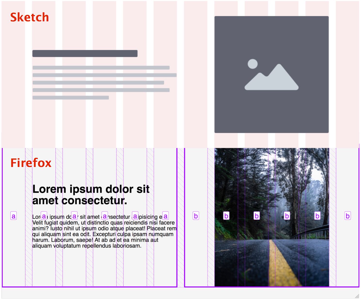
You'll notice that the grid in the image is set up as half and half, to which we then we make adjustments. My current workflow tries to generate base grids for as many common layouts as possible so I don't have to make too many adjustments later.